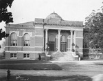
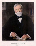
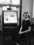
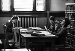
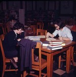
By 1904 the holdings of the small library on the second floor of the Main Building (Tillman Administration) had increased to over 5,400 volumes, and funds were solicited for a separate library building. Andrew Carnegie, who had a reputation for building public libraries, donated the entire $30,000.00 for the building’s construction. The architect, James M. McMichael of Charlotte, completed plans in 1905 and construction was completed for the 1905-1906 school year by R. A. Brown of Concord, NC.
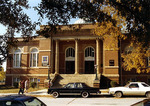
The monumental, but modestly scaled, building combines the most luxurious building materials (granite, marble, copper, glazed brick, tile, stained glass, limestone) with architectural features of French Imperial styles popularized by Louis XIV (Versailles Palace) and later during the reign of Napoleon III (Paris Opera House).
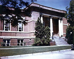
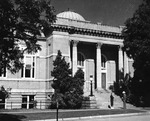
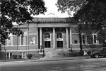
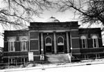
The original library has a symmetrical rectangular plan a projecting entrance portico and rear wing, removed in 1928. Its most unusual feature is a hemispherical, ribbed copper dome, with a glass crowned top for a skylight beneath, like the larger dome on the Paris opera House. The dome is raised above the hipped slate roof on a square stone base with rounded corners and pediments on each side. A masonry and stone parapet, hiding the roof of the main wing and portico, has a heavily denticulated, molded stone cornice with a narrow denticulated frieze.
Masonry pilasters run from the parapet to the rusticated granite foundation course, dividing walls into bays. Within each bay is a high Italian arched window with a smaller, 1/1 sash, set off from the granite wall with limestone sills and flat, radiating limestone arches. Plain limestone belt courses break the height of the tall main story, giving a two story appearance.
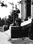
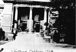
The entrance portico is supported by three carved stone Corinthian pilasters. This is an unusual arrangement, since most classical buildings have an even number of portico columns for an odd number of openings, allowing for a central entrance. Two other examples in South Carolina of this rare configuration occur on the porticoes of Robert Mills’ Bethesda Presbyterian Church in Camden and of the William Roper House on East Battery in Charleston. Double Italian arched entrances with pedimented transoms and paneled double leaf doors were scaled to match the windows. The portico has a colorful, hexagonal tile floor, granite steps, and a Sullivanesque metal ceiling with floral designs.
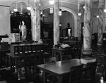
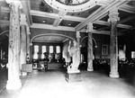
The portico opened into the main reading room of the library with a high ceiling crossed with heavy wood beams, creating square ceiling panels. Six smooth Ionic Columns, with high, round bases and separate wood cornices supported the central dome and circular, multicolored Art Nouveaux stained glass skylight beneath it. The main ceiling beams over columns and wall cornices are denticulated, like exterior cornices. Wood bookshelves were on inside walls of the reading room. Metal stacks were in the back wing, semi-circular arches, on either side of the main arch, led to basement stairs and a covered passageway to the South Dormitory (McLaurin Hall). The sheer plaster walls had molded wood chair-rails continuous with the molded frames of the windows.
The basement, which was not finished until 1920, contained additional stack areas, workrooms, and storage for periodicals. Eclectic oak railings on basement steps are particularly amusing in such a formal, classical building.
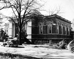
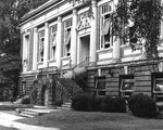
In 1928 a large rectangular back wing was added for additional stack area and alterations made to the 1905 portion. The 1928 addition retains the same classic design of the original building, but with slight variations and on a larger scale. It was designed by Edwards and Sayward of Atlanta and built by T. C. Thompson & Sons of Charlotte, for $77,000.00.
The addition has a truncated hipped roof with a masonry and stone parapet. Its molded cornice has a wide, plain stone frieze with decorative medallions over the pilasters. Half-round pilasters, running to a molded limestone belt course above the granite foundation, are in the “Tower of Wind” style used on other Winthrop buildings (Johnson, Joynes, and Kinard). Windows in the bays formed by these pilasters are rectangular 1/1 sash with sidelights and transoms, plain wood frames and continuous stone lintels and sills. Corner windows have more elaborate stone frame broken pediment and medallions. It is approached by symmetrical stone steps to an arcaded granite landing and more stone steps to the recessed doorway. Surrounding the basement is a stone areaway with stone pillars.
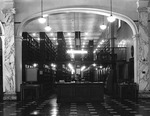
The interior of this addition, in spite of its elaborate facade, was mainly reserved for double-level metal stacks. The stacks were surrounded by outside halls for easy access with metal steps to the second level. In the basement were additional stacks, storage areas, and offices. Where the addition joins the 1905 building, the back wing of the original building was removed, so that the arched opening behind the circulation desk led directly into the larger space of the addition.
In conjunction with the 1929 wing, the original building was renovated with new doors, windows, and lighting fixtures throughout. The Italian arch stone frames of windows and doors were kept, but deteriorating wood frames were replaced with semi-circular fanlights and taller sash insets, without the pediments. Basement windows were extended downward and the stone areaway of the addition carried all the way around the original portion.
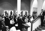
In 1970 after the Ida Jane Dacus Library on Oakland Avenue was built, the Carnegie Library was remodeled on the interior and converted into a fine arts center. All metal stacks were removed, and the 1905 reading room was partitioned into four large classrooms and a central gallery/hall. Unfortunately, the marble columns were encased, and the semi-circular arches filled in. However, most of the interior features were retained and integrated into the adaptation by Paula Treder, Architect, of Rock Hill. The large, arched windows are especially appropriate for studios. The main entrance gallery/hall, with its elaborate skylight and arch, gives visitors to the art department a fascinating visual experience and felling for space.
The large stack area on the main floor was partitioned into two levels, with a large full-height gallery which can be entered directly from the south steps. The partial upper level has a bank of faculty offices and studios, with classrooms and studios beneath it. Basements of both sections were partitioned for offices, classrooms, studios, and labs, giving the art department the most luxurious and spacious quarters on the campus. During this renovation no exterior changes were made.
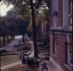
Carnegie Library is possibly the best example in the state of classic revival architecture after the 1897 Columbian Exposition when this style became popular for libraries, post offices, court houses, and residences of the wealthy. Its only serious architectural flaw is the overly elaborate facade of the 1928 addition. Clutter was a desirable mode of expression at the time, when a show of wealth was intended. The 1905 portion remains superb, even though some of the brick has been mottled by deterioration. Conversion of the building into an art center is a better use for the structure than a library, because it is not spacious enough for open stacks and work areas that most modern colleges require. Sitting on the quiet end of campus and the gradual growth of trees on the front lawn greatly improved the illusion of classical antiquity.


